Faber Castell Watercolor Markers Demonstration and Review

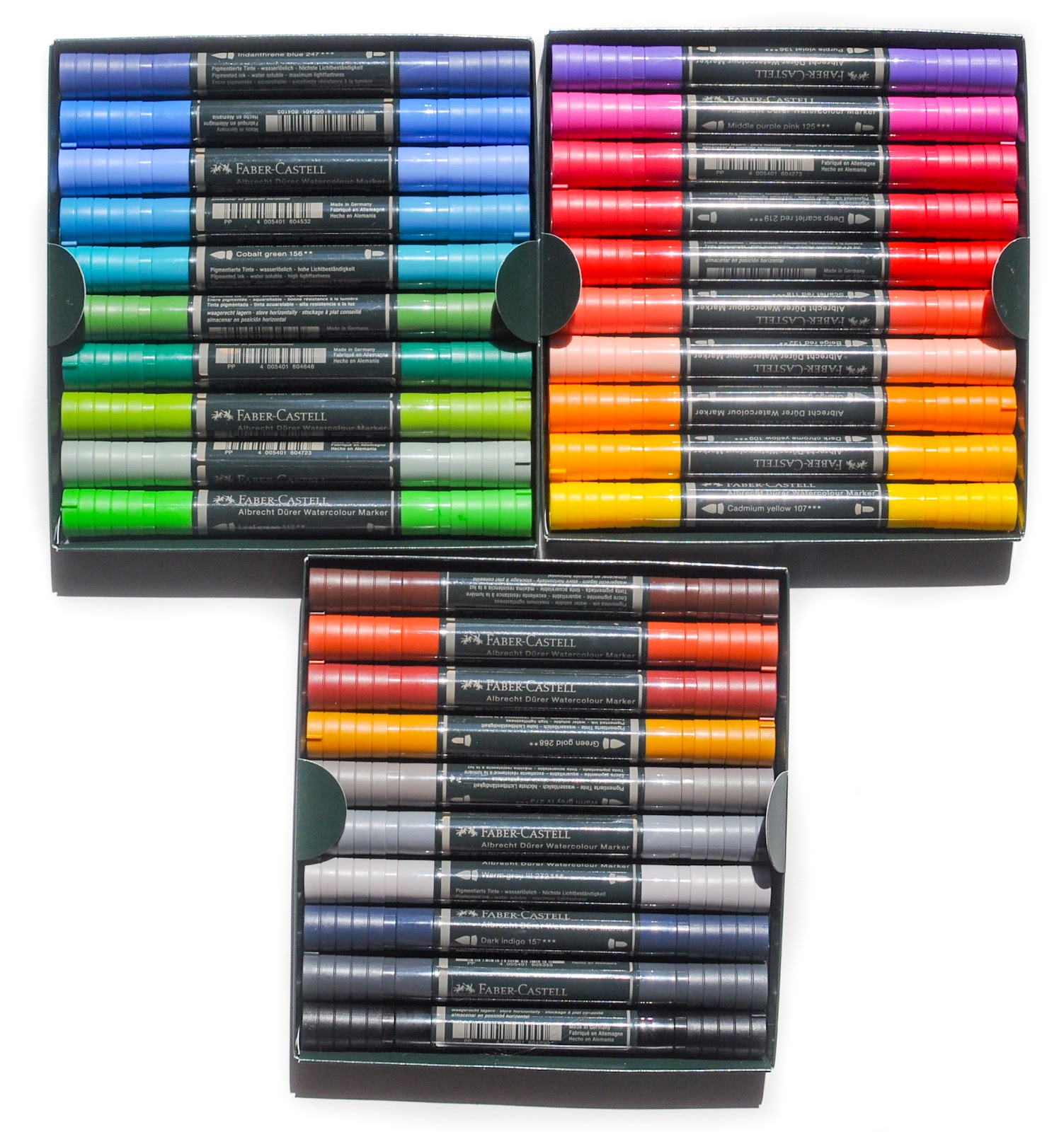
I love anything Faber-Castell makes. They have really good products even if they are very expensive. The best thing about these watercolor markers is they are lightfast. Not many markers are light fast. The colors are super vibrant and there is a ton of ink that can be drawn out from one marking on the paper. The markers come with two tips a brush and a thin line marker. There are only 30 colors, but most of them are unique and they can be combined to make more colors.

This blog post contains affiliate links.
 

The markers can be used three ways as illustrated below. They can be drawn on a different surface and then painted on. The markers can be used as straight markers, but that is super bold. I would use them sparingly when doing that. Or then can be drawn on the surface and then spread. I like C the best below, drawn on the surface and then spread, but I also like A a lot also.


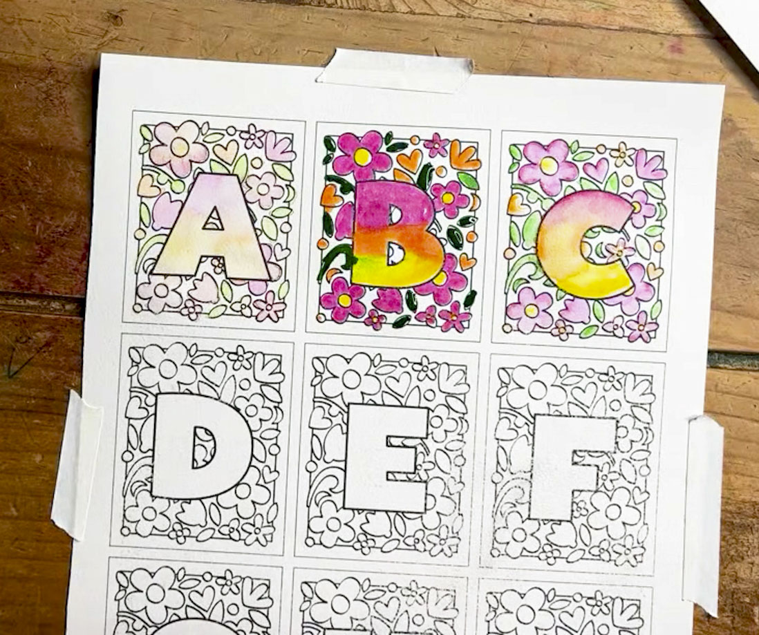
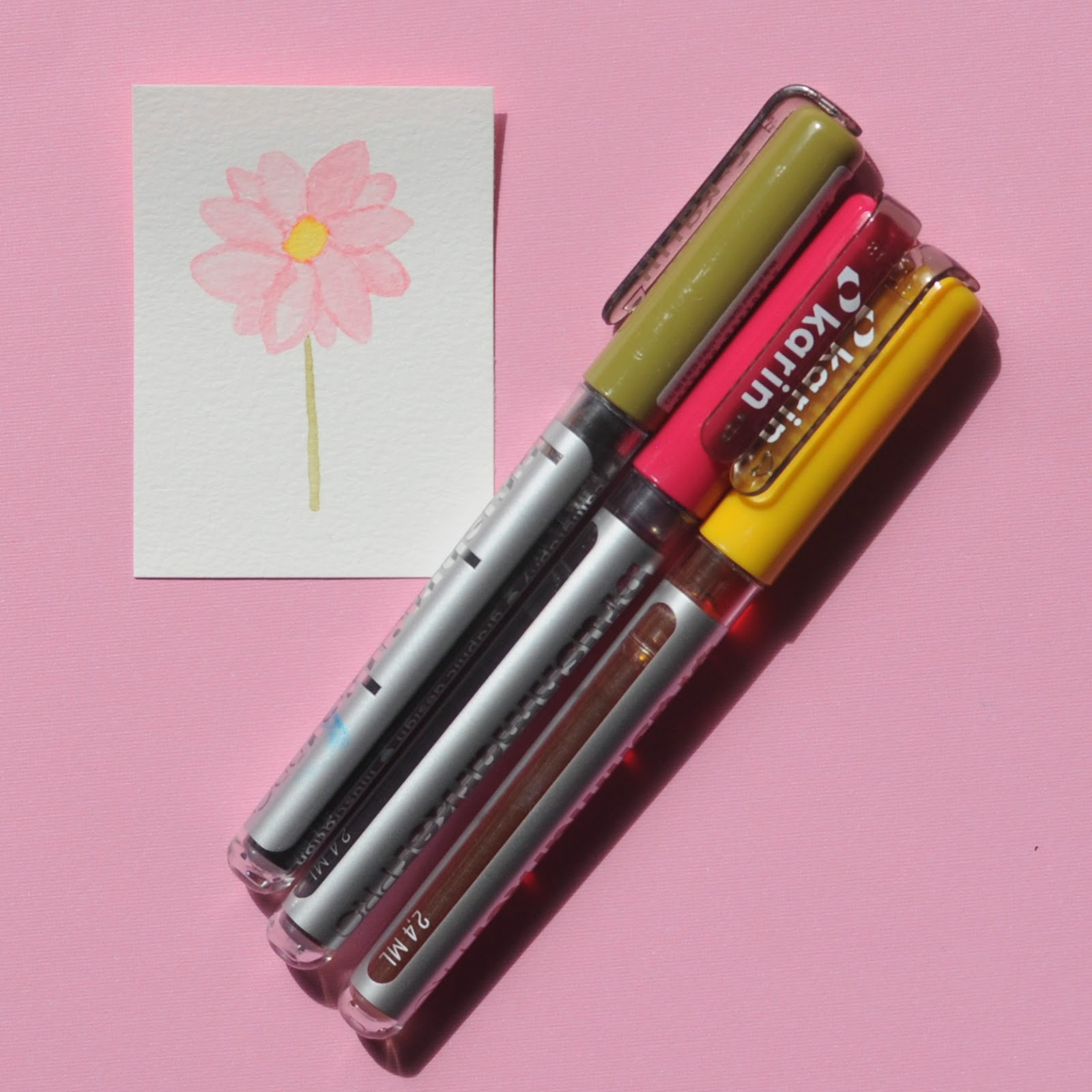
Here are the song titles to Taylor Swifts 1989 (Taylor's Version) I did in watercolor. I drew the color on a Yasutomo dish and then used a water brush to spread the color.


What is really cool is because Faber-Castell has the same color system for all their supplies the markers can be used with the pencils. All You Had to Do Was Stay shadows were made with pencil while I wish You Would and Wildest Dreams were made with the fine tip of the watercolor marker.


Here is the front of the box.

 Color Information

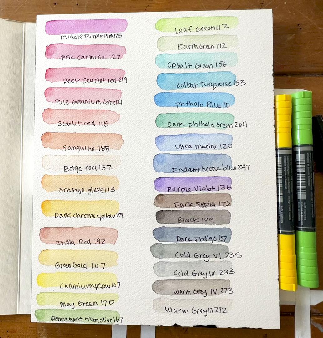
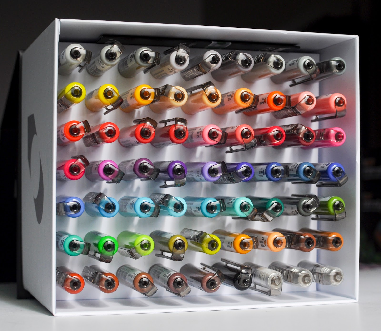
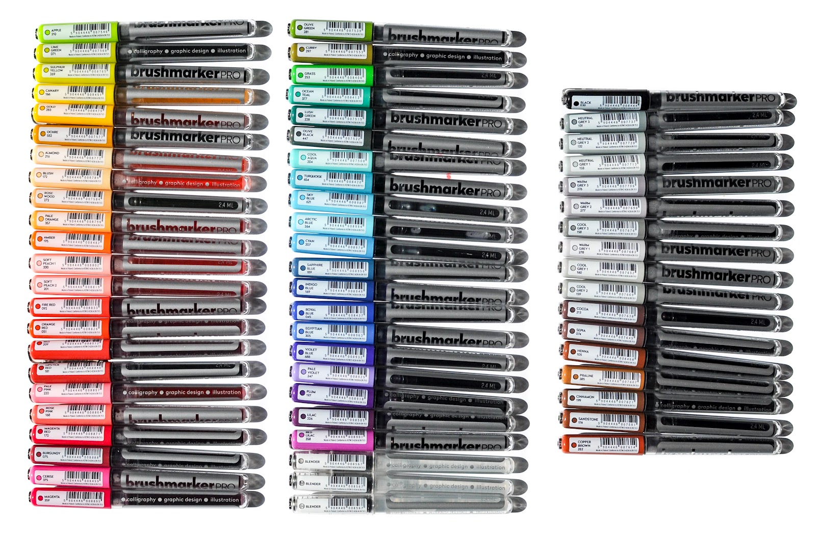
Here are all the colors in the box. Each marker contains a color number.

What's inside the box: 

  • Middle purple pink 125***
  • Pink carmine 127***
  • Deep scarlet red 219***
  • Pale geranium lake 121***
  • India red 192***
  • Scarlet red 118***
  • Sanguine 188***
  • Beige red 132***
  • Orange glaze 113***
  • Dar chrome yellow 109***
  • Green gold 268***
  • Cadmium yellow 107***
  • May green 170***
  • Permanent green olive 167***
  • Leaf green 112***
  • Earth green 172***
  • Dark phthalo green 264***
  • Cobalt green 156***
  • Cobalt turquoise 153***
  • Phthalo blue 110***
  • Ultramarine 120***
  • Indanthrene blue 247***
  • Purple violet 136***
  • Dark sepia 175***
  • Black 199***
  • Dark Indigo 157***
  • Cold grey VI 235***
  • Cold grey IV 233***
  • Warm grey III 272***
  • Warm grey IV 273***


Collecting Information
Boxes: 30 Faber-Castell Albrecht Durer Watercolour Markers
Year: unknown
Purchase Information: Blick
Where to buy: Blick
Part Number: 100-115-942 16 03 30
UPC: 4005401603306
Manufacturing Location: Germany

Here is the back, inside and side of the box.


Read More »

12 Karin brushmarker PRO Neon Markers

Earlier this year I was able to try out the Karin Brushmarker Pro Markers and they were incredible. These are the Neon Karin Brushmarker Pro Markers. The colors are vivid use the same technology as the other markers. They are very soupy and wet when they go down and do not dry out. They are some of my favorite markers from this company!

This blog post contains affiliate links.

Color Information
I have included all of the Karin markers in this swatch chart. Click here to get this swatch chart. The colors come with a name and a number and their own bar code.

Here are the Neon colors:
  • Neon Yellow 6102
  • Neon Orange 6120
  • Neon Yellow green 0230
  • Neon Green 6111
  • Neon Pink 6140
  • Neon Red Lilac 4072
  • Neon Canary 0220
  • Neon Orange Red 4020
  • Neon Light Green 6110
  • Neon Blue 6152
  • Neon Violet 6172
  • Neon Violet Blue 5272

Here is a coloring page I did with the Neon markers.


Here is some lettering practice I did with the markers. I love love love the bright colors.


Here is the packaging for this set of markers. It is not my favorite because it is hard to see them all at once and getting out is a bit tricky, but at least there is packaging. There is a also a box that includes the regular and neon Karin brushmarker PRO markers.

Collecting Information 

Boxes: 12 Karin Brushmarker Pro Markers
Year: 
Purchase Information: Amazon
Where to buy: Blick.
Part Numbers: 27C12 
UPC Numbers: 5904446025908
Manufacturing Location: Poland


Read More »

63 Karin Brushmarker Pro Markers

One of my followers, Danielle told me that Karin markers were incredible! And now I know they seriously are. I have been trying to do more lettering this year and knew I needed to try these out. I had struggled lettering with Tombow markers and it was difficult. Lettering with the Karin markers was much easier. They are a GREAT lettering marker for beginners.

Karin markers are a dye-based marker and the neon colors are a pigment based. Pigment molecules are much larger than dye based molecules and need to be shaken to make sure the pigment is evenly spread. Pigment has the advantage of being more lightfast than dye. Each marker contains ml of dye and have a durable flexible nylon tip. They are made in Poland.

Karin sent me these markers in exchange for an honest review. This blog post contains affiliate links.


The markers come in a box that has a spot for each of the markers. The markers were a little hard to pull out, but that is probably because it has not been used much. It is recommended to store these vertical.

Color Information
The colors come with a name and a number. There are 3 blenders in the set which is super nice to never run out of a blender. The markers are individually labeled and have barcodes on each. The only thing that is a concern is they do not have an AP label. They are new to the US market. Hopefully in a couple years this will get remedied. This is the symbol that the ACMI association has tested and labeled the markers non toxic. It does not have it so there is no way to know.

The markers had some amazing laydown properties. I just did the swatch chart in the order they were in on the box. I made it to practice filling in an area akin to coloring and a place to practice lettering strokes. The colors filled in very nicely all except the grays, they were a little streaky. Click here to get this swatch chart.


What's inside the box: 
  • The colors in the 63 count Karin Brushmarker Pro set are: APPLE 210, LIME GREEN 071, SULPHUR YELLOW 269, CANARY 166, GOLD 283, OCHRE 552, ALMOND 216, BLUSH 172, ROSE WOOD 272, PALE ORANGE 357, AMBER 195, SOFT PEACH 1 200, SOFT PEACH 2 201, FIRE RED 092, ORANGE RED 051, RED 209, LIPSTICK RED 181, PALE PINK 220, ROSE PINK 168, MAGENTA RED 170, BURGUNDY 075, CERISE 375, MAGENTA 359, OLIVE GREEN 281, CURRY 297, GRASS 253, OCEAN TEAL 377, LUSH GREEN 228, OLIVE BLACK 447, COOL AQUA 204, TURQUOISE 654, SKY BLUE 621, ARTIC BLUE 264, CYAN 207, SAPPHIRE BLUE 189, INDIGO BLUE 169, ROYAL BLUE 045, EGYPTIAN BLUE 305, VIOLET BLUE 688, PALE VIOLET 247, PLUM 197, LILAC 226, RED LILAC 358, 3 BLENDERS, BLACK 030, NEUTRALY GREY 3 131, NEUTRAL GRAY 2 132, NEUTRAL GREY 1, WARM GREY 3 276, WARM GREY 2, 277, COOL GREY 3 158, WARM GREY 1 278, COOL GREY 1 160, COOL GREY 2 159, COCOA 213, SEPIA 074, HENNA 105, PRALINE 385, CINNAMON 199, SANDSTONE 174, COPPER BROWN 282  
I immediately pulled these out and practiced with them. I think they will be my marker of choice to practice lettering! I practiced my name, blending, all the lettering strokes, and all the letters. Practice makes perfect right?


This technique was accomplished by using a water brush. I wrote on a plastic surface, applied water with the brush and then painted it on the paper. I used a fine liner to write the word love.


Here is lettering I practiced for Earth Day coming up. To get a good blend I pulled the neighboring color down a little bit when I was lettering. The down strokes are nice and wide, but I was also able to achieve a small upstroke.


I used the blender to make this watercolor. I colored the marker on a plastic surface. Then I painted the flower.


Here is the box info for the markers. 
Collecting Information 

Boxes: 63 Karin Brushmarker Pro Markers
Year: 
Purchase Information: Gifted
Where to buy: Blick.
Part Numbers: 27C7 Brushmarker PRO Mega Box 60 colours + 3 blender set
UPC Numbers: 5904446025663
Manufacturing Location: Poland

Here is the top of the box.

Here is the side of the box.
Here is another side of the box.

And here is an orthographic view of the box.

Read More »

Faber-Castell 48 Goldfaber Regular and Aqua Colored Pencils Review

I recently found out there are other lines for Faber-Castell besides Polychromos at Creativation/Art Materials World this year. I went to Creativation to meet especially with Faber-Castell because I love their color system. They were my first meeting and they did not disappoint. They were so nice. They explained to me there are three current lines, the green line for professional artists, the blue line for hobbyists and students and the red line for kids. They sent me these Goldfaber aqua and regular colored pencils to try out. And I did try them out. And guess what? I was SUPER IMPRESSED. The colored pencils were super easy to color with, the colors were super vibrant and then even match the Polychromos color line.

This blog post contains affiliate links.Click here to find these pencils on Blick Art Supplies. 

These are a very affordable option. I looked on blick and the 48 colors were about 33 dollars. The only disappointment was the line only comes in 48 colors. I wish they had all 120 colors. I want to repeat again these were easy to color with, ie my hand did not hurt after I colored with them.

Other attributes from the back of the box include: 3.3 mm lead, excellent lightfastness, highly pigmented, water resistant for the smudge proof for the regular colored pencils, high break resistance and easy to sharpen.

These are the swatches for the 48 Goldfaber Aqua colored pencils. I only activated the watercolor in half the swatch to see what it looks like with out the watercolor. I absolutely love the color palette. It is bright and colorful.

Here are the Goldfaber colored pencils on bamboo paper. I love the gradients that are possible from the colored pencils.

Here are the colors in the Goldfaber line. They are the same in box boxes:

  • 136, 133, 125, 123, 134, 119, 132, 131, 130, 126, 121, 118, 115, 109, 108, 107, 105, 104, 173, 167, 170, 166, 266, 163, 161, 162, 158, 156, 153, 149, 154, 147, 140, 120, 143, 151, 137, 199, 233, 273, 176, 283, 192, 187, 183, 250, 251

Here is the case for the colored pencils. The pencils are all individually skewed. They are also sold open stock. The color names are not on the pencil, but the color number is and that corresponds to the Faber-Castell color system. I love the detail in the tray that is also found in the Polychromos line. See those straps? It is made that way so the pencil trays will easily come out. These are the watercolor pencils.Here are the regular colored pencils. They are very similar except the wood color is black. That is nice so the aqua and regular pencils will not get confused with one another.

Here is what the pencils look like on black paper.

I also created a swatch chart for the colored pencils. Click here to get the chart.


I would definitely purchase these and will have my kids use them. They absolutely love my colored pencil collection :)

Find these on Blick Art Supplies.

Here is the packaging information for the colored pencils. It does note not to dip the colored pencil in water.
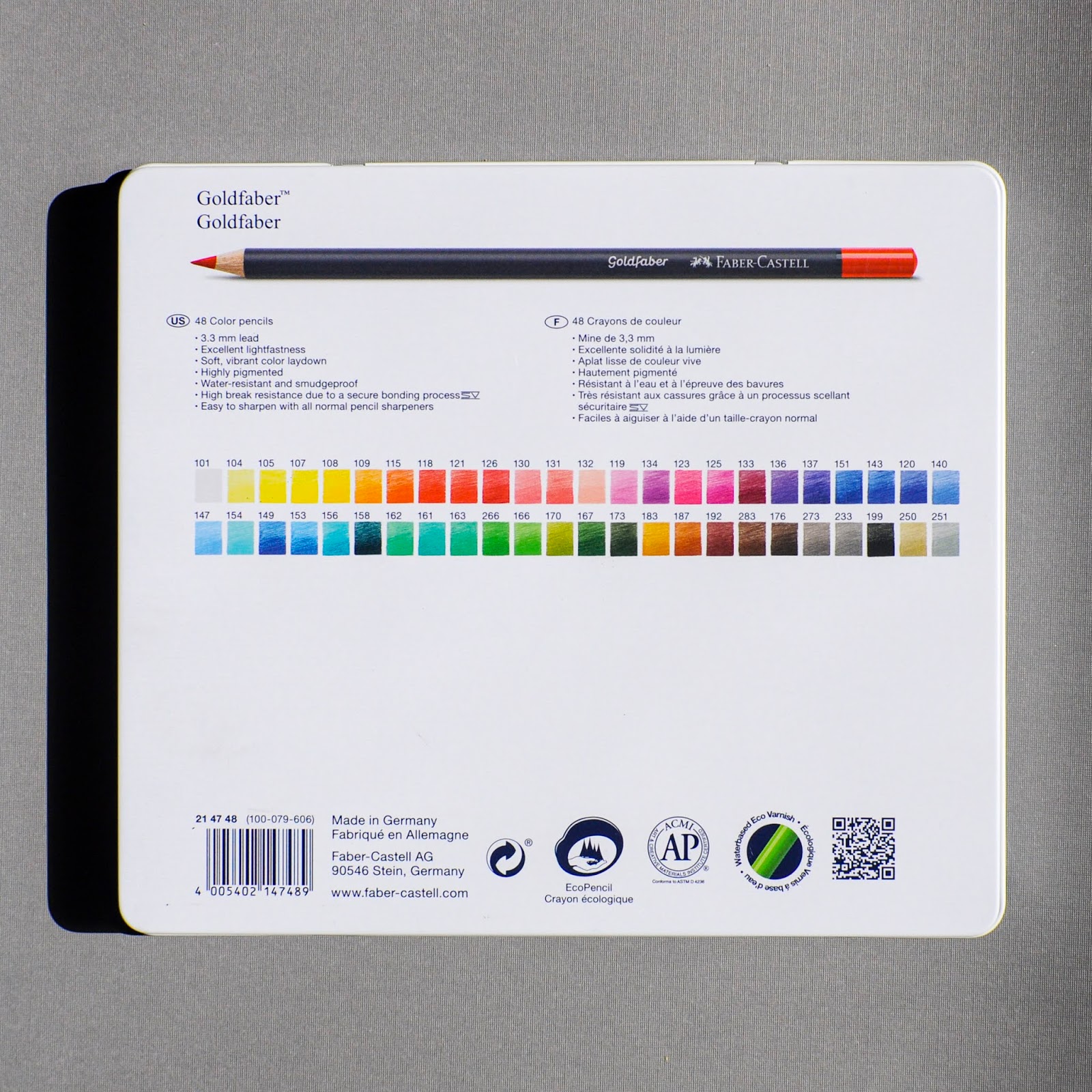
Here is the packaging information for the regular colored pencils.Here is the inside of the tin featuring the Faber-Castell Castle Stein near Nurnberg, Germany.

Read More »

Coloring with New Tombow Supplies!

Have you tried Tombow supplies? I have used their adhesives for years. But I have not used their markers before.  My husband has used their pencils and erasers. I was so excited to receive these supplies from Tombow in exchange for an honest review. Scroll through this blog post and see what I have made.

Have you ever tried alchohol markers? Tombow makes water based markers and alcohol markers in 108 colors. When I first tried alcohol markers they were intimidating. I had to learn how to use them. I was a little intimidated when I got these ABT-PRO alcohol markers from Tombow. I wondered if I could use them the same as other alcohol markers. I learned that yes, they work the same!  I think this is my favorite thing I colored today and it makes me want to get more alcohol markers!

This blog post contains affiliate links. The art supplies were provided by Tombow and the coloring book by Hopscotch Girls.

I colored the bottom right flower first. I just used one color and layered on the marker. The first petal I did not go with the grain of the flower and I can tell. These are after all practice flowers...After I made all my strokes in the grain of the flower. And then I layered the flower with more strokes at the edges.

The next flower I used two colors to make the petals. I used P815 an P856. I colored the whole thing with the pinker shade then used the red shade on the edge of the petals. Then I followed with a layer of more pink adjacent the red. I then blended the pink shade back into the red shade by coloring over the joint with the lighter color, ie blending with the lighter shade. 

For the last one I used two markers only. I used layering techniques, blending two colors by blending with the lighter marker, and holding the marker tip to marker tip to get the graduated color effect. That flower is my favorite. 

I found out my favorite thing about alcohol markers is they are super fast to color with. It would have taken me four times as long to color with with colored pencils. They can be so versatile especially when different coloring techniques are used with them.

Here is some leaf practice. It is amazing the gradients that can be achieved by using one marker.

Here are all the supplies that I received from Tombow after Creativation/Art Materials World. I was super excited to get them. It was like Christmas! There are 3 TwinTones missing from this picture, but I made something to show using the TwinTone.


I colored this page from the Hopscotch Girls "I Am Confident, Brave & Beautiful”
Coloring book using the water based markers from Tombow. I used a rainbow order color palette. Since I did not get a purple water-based marker with the set I used a Twin Tone. It blended pretty well. I colored half the letter and used the colorless blender to color in the bottom. 

This page was fun to make. I used the water based markers and the blending palette. It is my abstract art creation. I used the blending palette and spray bottle to make the splatter background. The blending palette blended the blue and green together, but the elements of the colors were still there and helped the words stand out and be tied to the color of the background. I then colored in the "I am Creative" with the two markers. I used the colorless blender to spread some of the color around the word bubble. I think I may even spread it all the way around the whole bubble. Sometimes it is good to keep going with coloring, but good to know when to stop. It is a balance.
My daughter colored this page with all the Tombows. I love her creativity!
Here is some lettering I did with the Tombow TwinTone. I used a Mono pencil to make the lines, because I can not make a straight one for the life of me. Then I did some faux calligraphy. I used the other tip of the TwinTone to outline and then I used the sand and rubber eraser to erase the lines.
The paper I used is Hahnemuhle Nostalgie white paper and DCWV cardstock. Click here to find the paper I used on Blick.

I dug up some of my cards I have made the past few years using Tombow adhesives. Which one is your favorite? A Cricut and rubber stamps also help with card making.


The last thing I am showing is a drawing my husband has done with the Mono 3B pencil. He loves these as shown by the short pencil. I love this drawing he did!


All in all I loved all the supplies from Tombow and can not wait to color some more! What was your favorite project or supply?

Read More »